White on Light
For most PODs there is a difference between how light and dark apparel is printed. The most noticeable effect of this difference is where white appears in the design. On light apparel there is no white ink and white in the design simply shows the fabric color. Designers sometimes get the idea that the POD is replacing the white, removing it, for some mysterious reason. So they decide to "work around" the issue by using some light color such as a light grey or light blue. This doesn't work for printing on light apparel for the same reason it wouldn't work on your home color printer. The ink is translucent, not opaque.
"White" for the POD and your home color printer means no color is deposited. If there is a little bit of color in the image, then a little bit of ink is printed. Whether you can see that little bit of ink depends on the color of the fabric and the color of the ink. Use colored paper in your home color printer and print your design. What happened to your design colors? That is similar to what happens with printing on fabric.
The ink for most light apparel processes is unable to block the color of the fabric. It isn't just white that is affected. All ink color will be influenced by the color of the fabric. Using your home color printer to print your design on colored paper will show the same effect. The physical quality of the ink being very liquid is one reason why it can be well bonded to the fabric fibers and why fine detail is possible. The light apparel process results in printing that is extremely durable, and does not add any new texture or feel.
To print any color lighter than the fabric requires something that entirely blocks the color of the fabric: the dark print process. In the dark print process an opaque underlayer is put down first in the same pattern as the design. The apparel is first treated with a bonding agent, then the opaque layer of white is printed then the layer is cured. The white layer is quite a bit thicker than ink and has embedded fibers to block the underlying fabric color. After curing the design is printed on top of the white layer with ink the same as for light apparel.
The dark print process will eventually be offered on light colors but there will be tradeoffs. The process is more expensive so the base price will rise - perhaps as much as 10 dollars per item. It takes longer to process. Because it requires multiple passes there is a higher risk of error. The feel is different, and the design wears more quickly. The range of design techniques is narrower. The required undercoat is textured which gives a different look and feel.
While the dark print process does not work with fades, gradients and similar semi-transparent processes, these techiniques generally work very well for the light print process. The light print process does very well with fine detail. The print area is part of the fabric, not sitting on top of it. While it doesn't start looking as vibrant as something like screen printing it is very durable and will retain its initial look for a long time.
Designing for White
For the most part the designer is more bothered by the fabric color showing through than the customers are. Customers will easily buy pink, green and yellow tinted dogs. A home color printer and a stack of colored papers will help the designer get an idea of how any particular design will print. The product previews are pretty reasonable. In my experience they are, if anything, more exaggerated than the real product. People typically see what they expect to see, even if it isn't really there. Colors will be influenced by the fabric color. So printing red on green results in brown. Printing blue on yellow results in green. Silhouettes do really well regardless of the fabric color.
While you can't print any lighter than the garment the fact that the ink is tranlucent means that you don't have to print darker. You can use light colored inks to tint the fabric in a way that gives the impression of white, even when it is definetly not white.
From JLW on giving designs the feel of white, without white:.
I have found that if i use VERY pale shades of yellow and pink they will print on the light tees. I often use them for the 'whites' of the eyes on my cartoon characters on light shirts.
If you mix a few colors in with your 'grey', so that it's not just made up of black ink, you will probably be able to get it to print on the light tees as well - I have.
You can't avoid the garment color bleedthrough, but you CAN mix colors knowing how they will be affected.....for example, if you're printing on a pink shirt, take some of the red or magenta values out of a color you're mixing....the garment will add some of that hue back in for you. Takes some experimenting, but it's something you can work with.
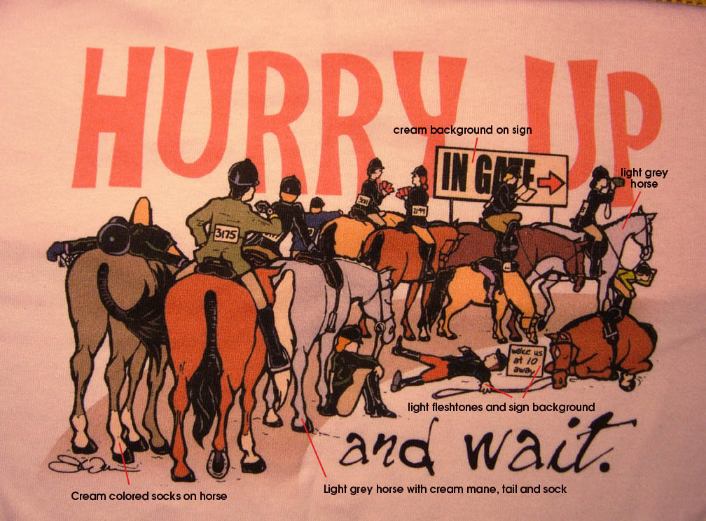
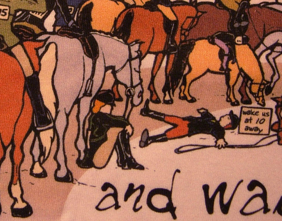
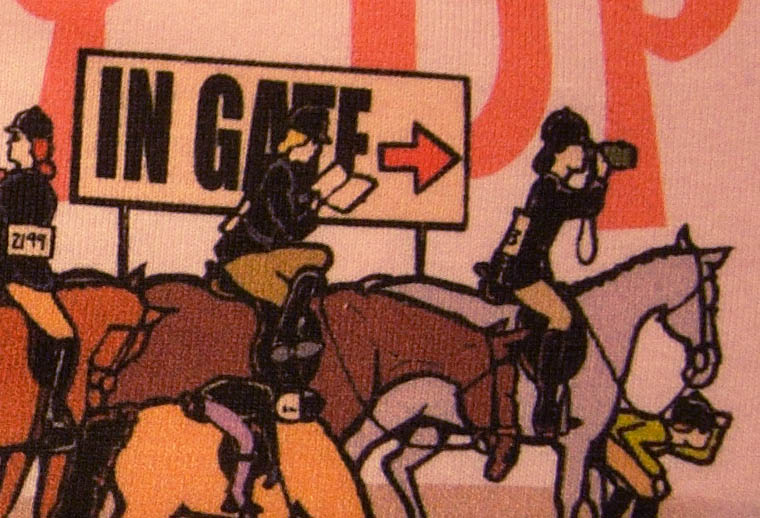
Now JLW wasn't the first to suggest it but was the first to say it in a way that made me decide it was worth looking at ... literally. The problem was that I couldn't get my mind's eye to see the results just from words. I needed pictures, which JLW kindly provided. The large picture was annotated to show the effect of light yellow on a pink shirt and a couple closesups give a better look.
|

